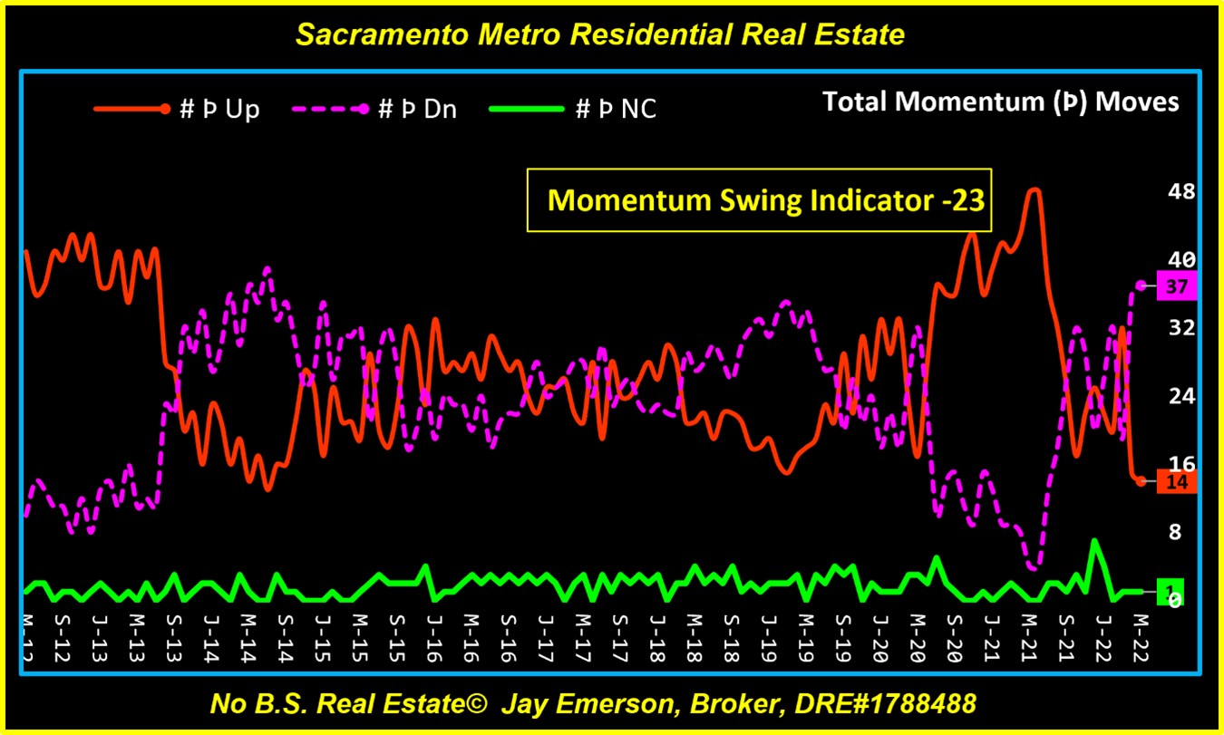
One of the benefits of using many (52) zip codes in my reporting system is that these charts can be reliable. This one, I call my “Momentum Swing Indicator” shows the ebb and flow of price momenta for these 52 zip codes. The latest “swing” was owned by the Downward moves, coming in 23 higher than Upward moves. Next month may show an even greater difference – Down over Up.
Averages From Many
Another benefit of having a large number of zip codes in my system is the generation of Averages. Every data element has an average and this table shows how each data element compares with its 10-year average. The 10 years in history are from the same month to preserve the seasonality of the residential real estate market.
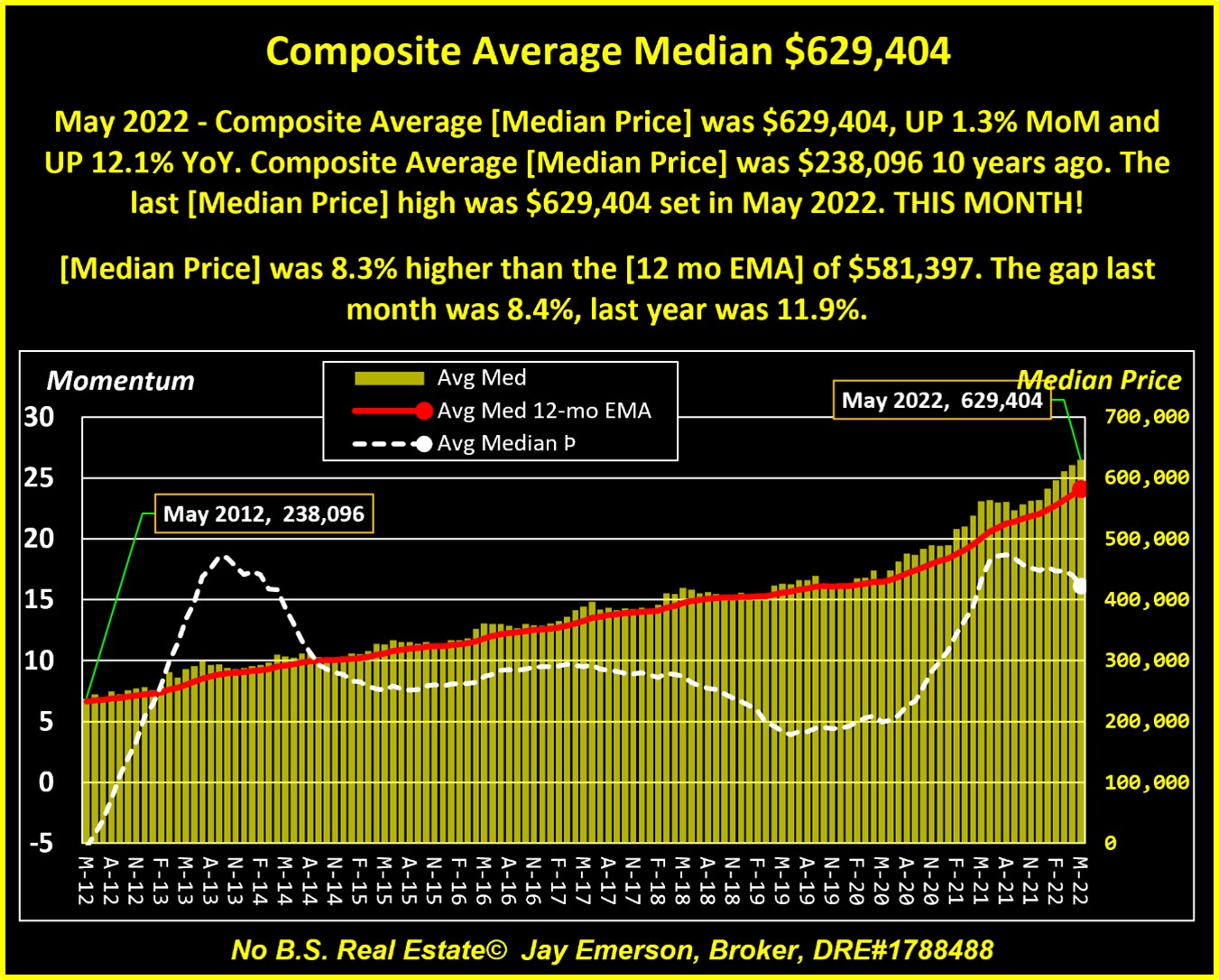
Average Price, Momentum and 12M EMA
What makes an up or down-market? When a home buyer keeps losing opportunities because other buyers are paying WAY beyond the asking price and when their lender has to send me updated pre-approval letters with higher amounts, that’s an up-market. But another way to show it is by watching my charts show Price, Momentum, and the 12-month Moving Average (12M EMA). When the 12M EMA is consistently lower than the Price, then the increase in the Price is outpacing the moving average. Likewise, when the moving average is consistently HIGHER than the Price, it’s a down-market.
Your Economy
I wrote this piece (Your Economy) in October 2020 as lockdowns were starting to weigh on goods and services. It is still relevant and a poignant reminder that we frequently re-visit past trends OR they get worse without fanfare.
P.S., no other professional I know produces this kind of detail from our local data. Sign up for my blog, please.